ASCII visuals are useful because they can make a page feel designed without requiring a full illustration system.
They can be loud or quiet, technical or playful, retro or editorial. The important part is choosing the right moment for the effect.
15 ideas worth testing
- Turn a launch name into a large ASCII hero wordmark.
- Convert a founder portrait into an About page visual.
- Use ASCII motion as a subtle hero background.
- Create section dividers that feel like part of the brand.
- Add a stylized product silhouette for a reveal page.
- Use ASCII text for event names, album titles, or campaign slogans.
- Create a low-key loading or transition moment.
- Turn portfolio thumbnails into a consistent visual system.
- Use a monochrome ASCII treatment on a case study intro.
- Create a retro terminal section for technical specs.
- Add motion behind a signup block without covering the form.
- Use ASCII texture in a footer or closing section.
- Build a visual contrast between clean copy and expressive media.
- Create a branded 404 or coming-soon page.
- Use ASCII art as a repeatable campaign signature.
Match the effect to the visitor goal
A launch page needs attention and clarity. A portfolio needs memory and proof. A campaign page needs a visual hook. A personal site needs a signature. ASCII can support each goal, but it should not replace the goal.
Before adding the effect, ask what the visitor should remember after leaving the page.
Avoid making every section special
If every section gets the same visual intensity, the page becomes tiring. Use ASCII visuals as anchor moments, then let body copy, screenshots, product details, and calls to action stay clear.
Make one idea the anchor
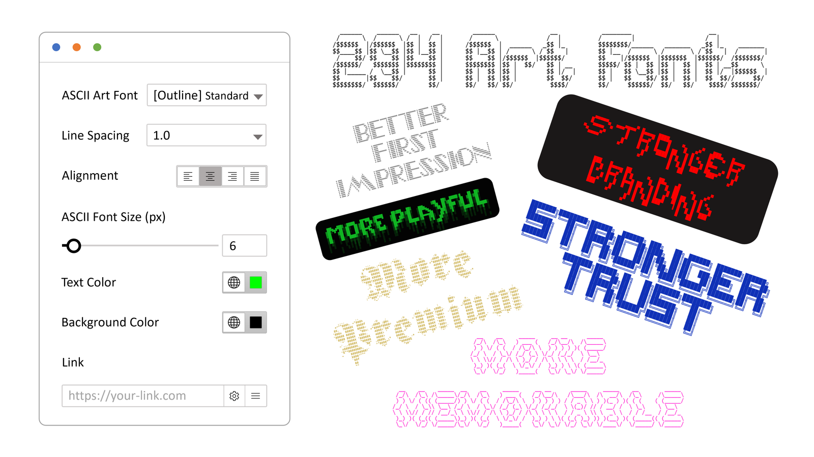
WP ASCIIfy supports ASCII text, images, and motion inside WordPress, with workflows for Elementor and the block editor. Pick one of the ideas above as the anchor, then let the rest of the page stay calmer around it.
Start with one anchor moment. If it makes the page easier to remember and easier to describe, the effect is doing useful work.