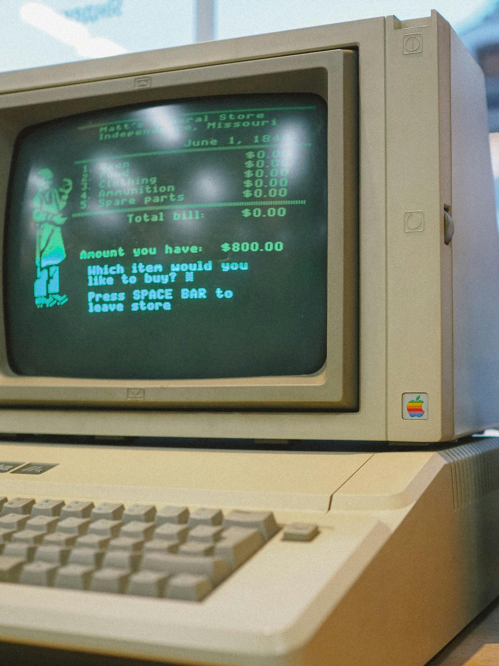
Retro-inspired web design can either feel memorable or costume-like. The difference usually comes down to restraint.
A good retro landing page does not need to copy an old interface perfectly. It can borrow a few signals: terminal typography, ASCII texture, limited colors, pixel-like spacing, analog motion, or a poster-like composition.
Choose one era signal
A page gets messy when it borrows from every era at once. Pick one signal that supports the brand. A developer tool might use terminal-style ASCII. A music launch might use poster typography. A creative portfolio might use an image treatment that feels digital and imperfect.
The signal should make the page easier to recognize, not harder to understand.
Keep the offer modern
Retro style should not make the page less usable. The headline still needs to name the offer. The subtitle still needs to explain value. The call to action still needs to be easy to find.
Use the visual style to create memory, then let the page structure do its normal job.
Use ASCII when you want a digital texture
ASCII visuals are especially useful for retro-inspired pages because they feel digital without requiring heavy illustration. A headline, portrait, product image, or short motion loop can become the page signature.
Use a tool when it speeds the experiment
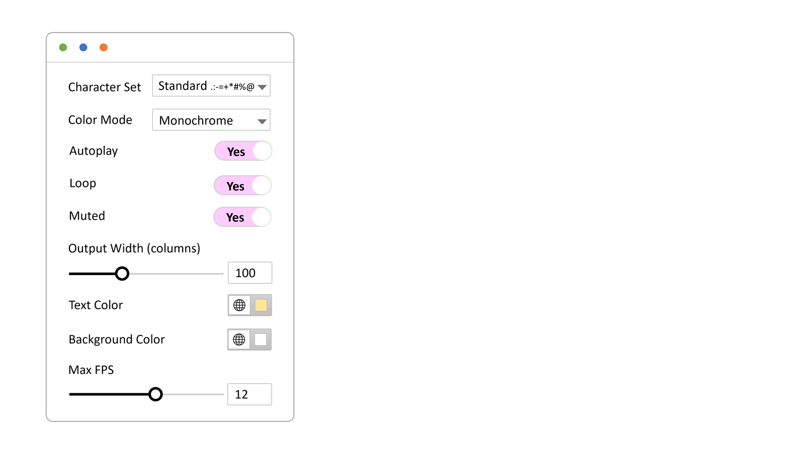
WP ASCIIfy gives WordPress creators a way to test ASCII text, images, and motion inside Elementor or the block editor. That makes it useful when you want to try a retro-inspired hero or campaign section without rebuilding the site around the effect.
Try one hero or section first. The Sable Personal demo is a good example of using motion as atmosphere rather than clutter.