ASCII visuals can make a WordPress page feel instantly different, but the setup works best when the effect has a job.
The job might be to make a hero section memorable, turn a portrait into a signature visual, add motion to a launch page, or create a retro-inspired brand texture. The effect should support the page, not distract from it.
Start with the content type
ASCII text, images, and motion each solve a different design problem. Text is good for headings and wordmarks. Images are good for portraits, product art, campaign visuals, and mood pieces. Motion is good for atmosphere and short attention moments.
| Content type | Best use |
|---|---|
| ASCII text | Hero headlines, section labels, event names, and visual dividers. |
| ASCII images | Portraits, artwork, product reveals, and branded image treatments. |
| ASCII motion | Short loops, intro backgrounds, and campaign moments. |
| Editor controls | Fast testing in Elementor or the WordPress editor. |
Choose source media carefully
Clear source material creates stronger results. For images, use a subject with good contrast and simple composition. For video, use short clips with readable movement. For text, use phrases that are short enough to remain legible.
The more complex the source, the more carefully you need to tune the effect.
Test readability before style
A beautiful effect still has to work as part of a page. Check contrast, size, spacing, and mobile behavior. If visitors cannot read the headline or understand the section, the effect is taking too much attention.
A simple build order
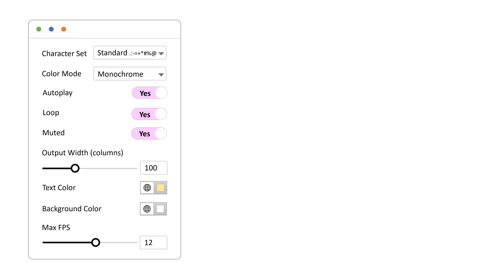
WP ASCIIfy brings ASCII text, image, and motion effects into WordPress with support for Elementor and the block editor. Draft the section normally first, then add the ASCII layer, then tune readability on mobile before publishing.
The WP ASCIIfy docs show the setup path for both editors. Start with one section, make it useful, then decide whether the visual language deserves to repeat elsewhere.